

Eye spacing describes a distance between specified eye landmarks, not a grade of attractiveness. In everyday close-set or wide-set descriptions, people often compare the gap between the inner corners with the visible width of an eye. That is different from the distance between pupils used in optical fitting. A straight, clear photograph can help you understand the description, but it cannot establish an ideal, diagnose a condition or tell you what your face needs to become.
Start by asking what you actually want to know. Are you confused by two photos, choosing a glasses frame or trying to understand a term in a face analysis? Those are manageable questions. Chasing a supposedly perfect gap is not a useful styling goal. This independent guide gives you a way to identify the landmarks, check the image and leave with one practical observation, without needing an app, a score or a purchase.
Eye spacing needs named endpoints
The inner corner is the point where the upper and lower eyelids meet toward the nose. The outer corner is their meeting point toward the temple. The pupil is the dark central opening visible within the iris. Before comparing distances, say which of those points you mean. A gap from inner corner to inner corner is not interchangeable with a span from pupil center to pupil center. A diagram that simply says eye distance leaves out an important part of the question.
FISWG's descriptive feature list distinguishes intercanthal and interpupillary distances. Its purpose is facial comparison, not beauty ranking. Here the useful lesson is only to name the endpoints consistently. Do not use a forensic description as validation of a FaceScore, or use a casual photograph to supply measurements for prescription lenses. If you need optical fitting information, get it through the relevant eye-care professional rather than repurposing a styling comparison.
What close set and wide set actually compare
A common visual convention compares the inner-corner gap with one eye's horizontal opening, measured from inner to outer corner. If the gap appears smaller, it may be described as close set; if larger, wide set. That language describes a relative appearance. It does not mean the eye is too small, the nose is wrong or the person is less attractive. Different tutorials and tools can also choose different cutoffs, so a category near a boundary should not surprise you.
If you make this comparison, consider both eye widths rather than picking whichever side supports the label you expected. Natural differences and a slightly turned head can make one visible opening narrower. You can simply write that the gap looks similar to, smaller than or larger than the openings in this image. You do not need to force a borderline observation into a permanent category. Eye shape, lid visibility and corner angle are separate descriptions, even when all appear in the same picture.
One eye width is a reference, not a requirement
The familiar drawing exercise that places an imaginary third eye between the other two is easy to remember. It is useful for understanding the comparison, not for deciding that every real face should match it. A reference diagram simplifies variation in order to teach a shape. Turning it into a pass-or-fail test changes its purpose. Your face does not become a problem because the space in a portrait differs from a neatly divided drawing.
A systematic review of intercanthal measurements found variation across its sampled groups and measurement methods. It challenges treating one reference population as a universal standard. It does not provide a beauty score or a personal target. Avoid borrowing averages from a clinical paper to rank yourself or infer your background. The practical conclusion is modest: a single ideal number is a poor basis for an everyday appearance decision. Keep comfort and preference separate from anatomical description.
Choose a photo that can answer the question
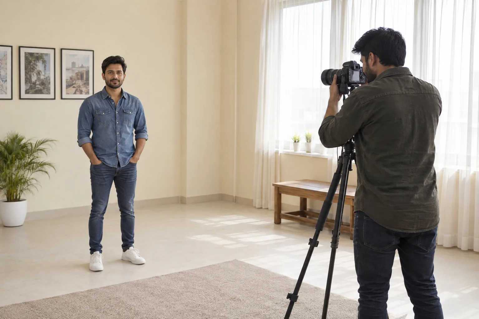
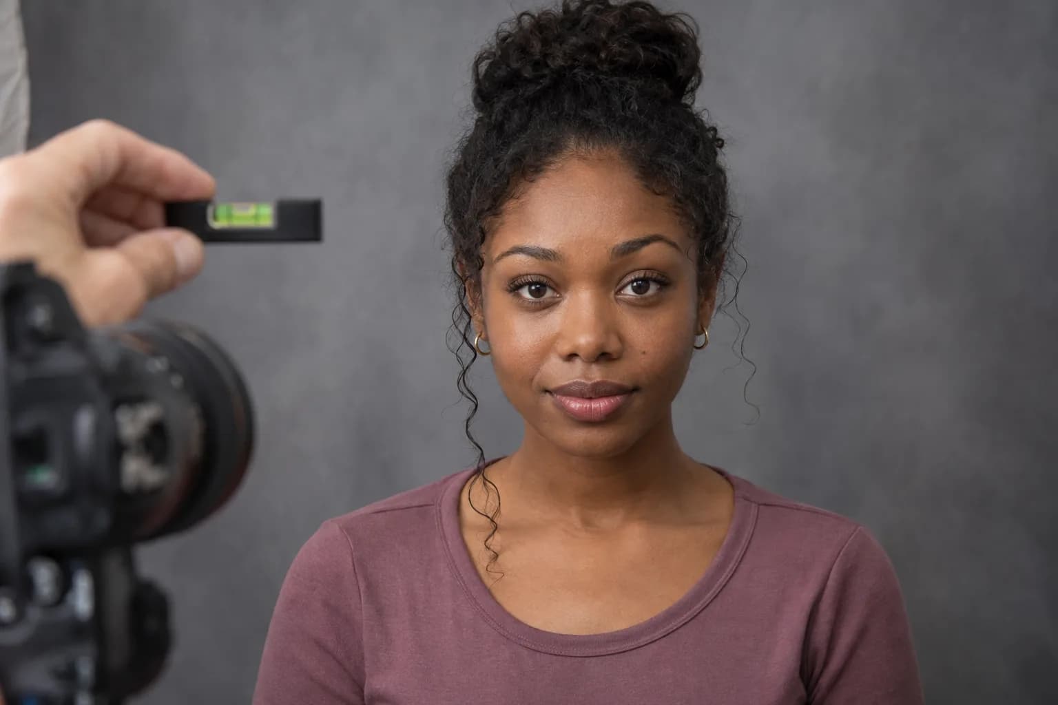
Use an original, unfiltered front portrait with the whole face visible. Put the camera near eye level, stand far enough away that you are not filling the frame from arm's length, and use a timer or another person if that helps. Face the lens rather than turning one cheek toward it. Keep the chin in an ordinary level position. A softly lit, relaxed photograph is a better reference than a dramatic selfie taken to emphasize one feature.
Keep the setting simple: even light across the eyes, no strong glare on glasses and no fringe hiding a corner. If you can comfortably remove glasses for one reference shot, do so; do not struggle to see or move safely for a photograph. Take a small number of images and choose the one that clearly shows both corners. This is not a general portrait competition. If the relevant detail remains unclear, leave the comparison uncertain rather than inventing precision.
Check pose before believing a changed label
A slight head turn presents the two sides differently to the camera. One opening can appear narrower, while the nose obscures part of the nearer inner region. Tilting the head introduces another visual cue, and squinting or raising the brows changes the visible eye area. If one photograph looks close set and another wide set, check those conditions before assuming the face itself changed. Differences between pictures are not automatically differences in anatomy.
Compare two unedited shots at the same display size. Look at the nose direction, relative visibility of the cheeks and whether the eyelids were relaxed. Do not stretch one image sideways to make it line up with the other. If the pose is noticeably different, retake one calm reference rather than calculate a correction. A photograph can support an approximate description while still being unsuitable for a precise ratio. Being unable to measure confidently is a valid result.
A paper comparison is enough; millimeters are not needed
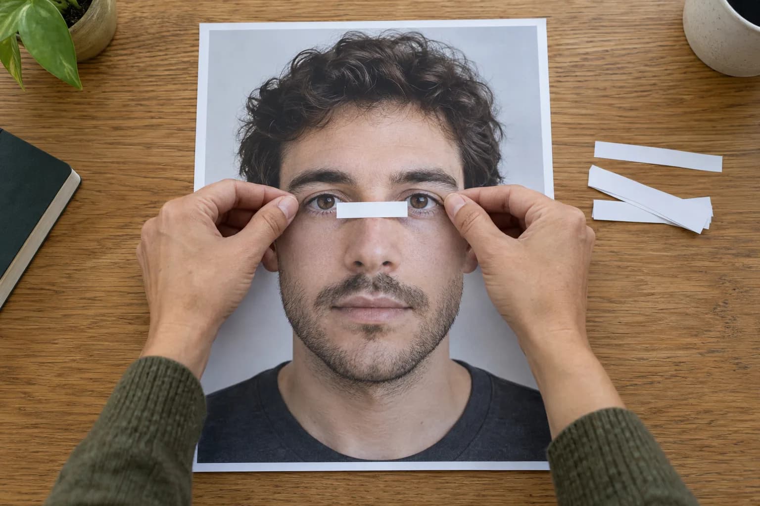
On a printed or clearly displayed reference, mark the gap on a separate paper strip, then compare it with the visible opening of each eye. Keep the strip on the picture, never near your actual eyes. You are comparing lengths within one image, not determining a physical distance. Do this once at a normal viewing size. Repeatedly zooming into eyelid edges often gives you more ambiguous pixels rather than a more useful answer.
For example, if the gap seems a little wider than either opening, write exactly that, followed by the limitation: this is a frontal photograph, not a calibrated measurement. Do not convert pixels to millimeters without a valid scale and method. Do not round an uncertain impression into a precise ratio, and do not label a generated illustration as your result. If a tool offers a number, ask which landmarks and definition it uses before comparing it with any other tool.
Keep spacing separate from brow and frame choices
Eyebrow starts, a fringe and a glasses bridge can change the surrounding frame without moving the eyes. That distinction matters when you consider a reversible style change. Try brushing your brows as they naturally grow or moving hair away from the eyes before making any removal decision. You do not need to pluck the inner brow ends to satisfy an eye-width rule. Changing a frame is optional; leaving the eye region alone is an equally legitimate choice.
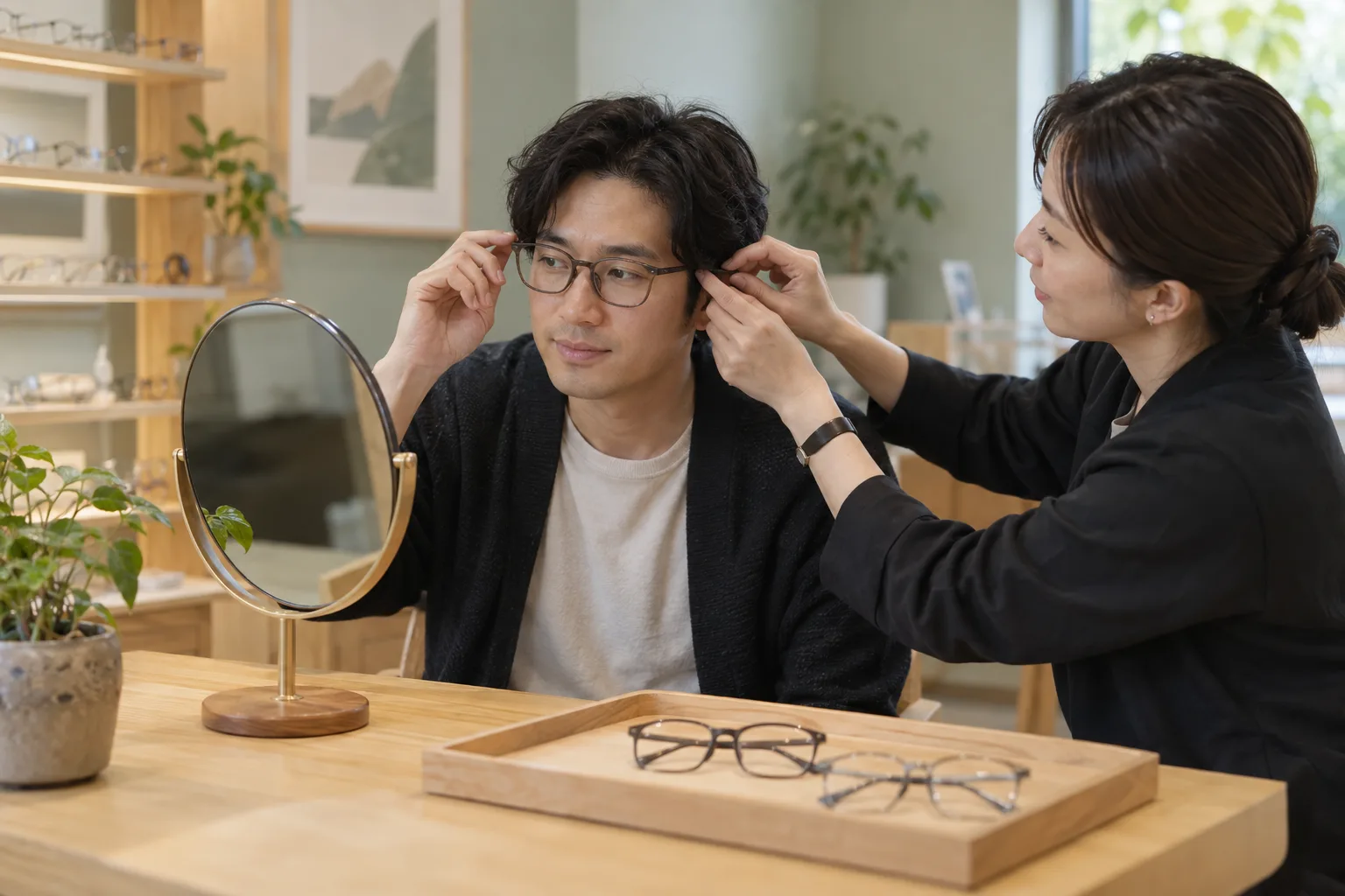
For glasses, begin with physical fit and the professional requirements for your lenses, not a rule that every wide-set face needs a dark bridge. Compare two comfortable frames with similar head position and look at the whole face. Notice whether the bridge feels stable, whether the temples press and whether you enjoy the overall frame. A style preference is not an anatomical correction. Ask an optician for fit help rather than using an eye-spacing photo as an optical prescription.
Read an app observation without outsourcing judgment
If a face-analysis app mentions the eye region, read its explanation before reacting to the category. Does it identify inner corners or pupils? Is it describing the photograph, or making a broader claim? An unclear label should not decide your next grooming step. MogRise can organize explained observations and a small appearance plan, but this guide does not claim that it supplies a particular eye-spacing measurement. A FaceScore or PSL-style rating is planning context, not a verdict on human worth.
You can work through the steps here without uploading anything. If you choose to use MogRise, it is free to download; that is not a promise of free unlimited features. Use one clear reference and one practical question, then stop. If the observation leads only to repeated rescanning or a longer list of supposed faults, set it aside. Useful analysis should make a decision clearer, not require you to prove your face deserves an acceptable label.
Finish with a description and a stopping point
A complete outcome might be: in this clear front photo, the gap looks slightly wider than one eye opening; I like my current frame and do not need a change. Or it may be: the corners are not clear enough, so I will not classify them. Both outcomes are more useful than a supposedly exact beauty ratio. Keep one note about the image and, only if it serves a real need, one reversible action such as trying a comfortable frame.
Do not use this process to diagnose a health issue or plan an irreversible change. Questions about sight, discomfort or a new physical change belong with an appropriate professional, not with a styling score. For ordinary appearance planning, return to the whole face at a normal conversational distance. Other people see expression, movement and context, not a paper strip. Close set and wide set can be neutral descriptions; neither creates an obligation to optimize the gap.